Final Major Project: Critical Basis For Presentation

As I reflect on nearing the end of the FMP, I’m obliged to consider what has and hasn’t worked in the way the work was presented on the website and at exhibition. The two key decisions about the presentation were 

·      grouping the images into triptychs 

·      presenting the images alongside text

I will endeavor to explain these decisions in this post.

Prior to starting this course I’d always thought of making photographs in terms of trying to create the single killer image, something as interesting and as beautiful as possible for its own sake. I’ve written in earlier modules about how repeated exposure to the work of professional practitioners on this course, and the opportunity to hear many of them discuss their work in interviews, gradually forced me to reconsider the importance of creating the single impactful image. It’s certainly easier to appreciate the value of a thoughtfully curated series of images when you feel the impact of the work either in a gallery or in quiet contemplation of a photobook. The potential for communication of a series of images is exponentially increased over what’s possible in a single frame. This understanding of the true importance of stringing images together arrived for me around the same time as I was trying to understand how to create visual narrative, for which analysis of Gregory Crewdson’s work was particularly helpful. 

So, I was struggling with the idea of narrative and how to create this both within an image and within a series of pictures. At this stage I was still shooting empty urban scenes exclusively and was not able to create anything that I felt effectively communicated the project’s themes. Feedback was always along the lines that the pictures were nice enough, but that the underlying message was not discernible.

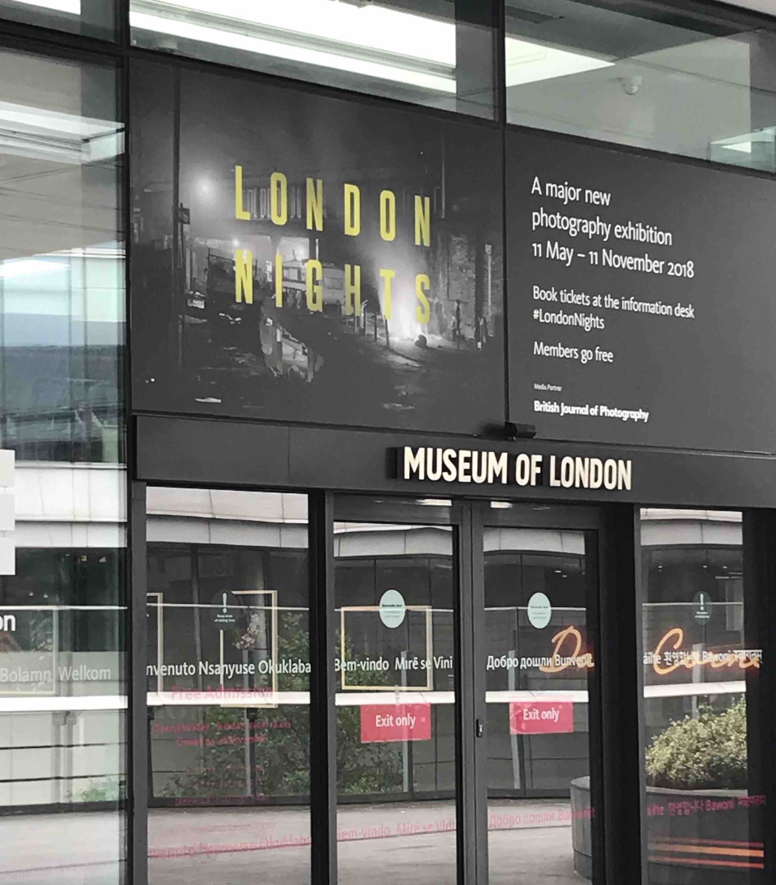
Big lightbulb moment came at this exhibition

Big lightbulb moment came at this exhibition

Visiting the London Nights exhibition in May was a key moment, as I’d been wondering about how to solve the narrative question for quite a few months without feeling any closer to figuring it out and so was unsure how I’d be able to produce a successful Final Major Project. At London Nights I saw lots of inspiring work, but a series of images presented in triptych really stuck with me – the connections suggested between each photograph were close yet non-specific enough, that the viewer was able to make links of their own without feeling that the photographer was being too didactic. 

Attempted diptych

Attempted diptych

At that stage I’d already experimented with a couple of diptychs, which I’d found unsatisfactory, but the third image seemed to bring balance and a plethora of additional narrative possibilities. The whole narrative thread opened out in front of my eyes and I resolved to try this with my own work. It was a ‘lightbulb moment’ in the journey of this project.  

Attempt to create an image with some internal narrative

Attempt to create an image with some internal narrative

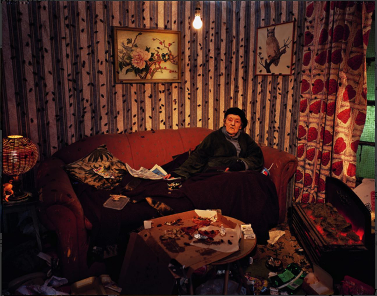
Once the penny had dropped, I tried creating semi-staged images, in a nod towards Crewdson, to see if I could create more visual intrigue in this way. Unsurprisingly, it did not work too well. The triptypchs didn’t work too well either initially and I felt this was mainly because they didn’t have an entry point – a way to invite the viewer into the story. I realised this would be best achieved by portraiture, using people to spark off the narrative, with the other two images inciting further questions. Images by artists such as Tom Hunter came to mind, whose portraits can on one hand seem almost mundane, but on the other hand are deeply suggestive and sometimes carry layers of additional meaning. I thus used work such as this as a role model to work towards. 

Living In Hell by Tom Hunter, from his website

Living In Hell by Tom Hunter, from his website

The key then was to make more portraits and as I was also convinced of the importance of including myself explicitly in the work, I accepted that self-portraits would be required too. I felt a responsibility to match the degree of exposure that my collaborators had offered to the project, and that the work would not be complete without an attempt at honest self-examination of my own state in relation to the issues under discussion.

Making more portraits confirmed that introducing people into the work was the key to bringing the triptychs together. The stories that each portrait suggested based on my own personal knowledge of the subject, or on elements that were suggested from the image itself or from discussions during the shoot, guided further shoots to create images that worked with the portraits or that allowed links to be made with other images made during the project. 

I had also explored the use of text earlier in the project and subsequently abandoned the idea as I felt that I’d somehow lost my way in telling the story I wanted to tell. One of our tutors had also commented to the effect that I’d lost my own voice in trying to seek the views of a large number of other people and I’d taken this to heart as it was a very perceptive observation. I continued to collect writing from collaborators though and to interview the people I was shooting. I was also writing poetry inspired by the project theme and in response to some creative writing that one of my collaborators had written. 

Page example from Hackney By Night by David George

Page example from Hackney By Night by David George

Once the triptychs started to take shape and I felt more confident that they’d be able to suggest a story, the potential interaction of words with these images was again interesting to me. Works like Hackney By Night by David George and London Ends by Philipp Ebeling, where text either accompanied the images in a standard ‘image facing text’ (Hackney By Night) kind of way, or in a more whimsical thread running through the book (London Ends) also proved that this might be an effective way to present the work. 

Page example from London Ends by Philipp Ebeling

Page example from London Ends by Philipp Ebeling

In each of the above two examples, I was particularly interested in the fact that the text did not necessarily appear to relate directly to the image(s) it appeared with in the presentation. This seemed to offer another opportunity to introduce interpretative uncertainty for the viewer, keeping them a little off balance when trying to understand the work and seek for answers within the triptych. I definitely didn’t want to end up with captions, but with text that further opened out the potential interpretations of the pictures, with the aim to offer as broadly applicable a perspective of the issue as possible, such that the viewer is more likely to be able to connect with some aspect of the work. 

The writing in Hackney By Night is a great example of writing that expands the mood of the images without seeking to directly explain them. Again, as I was aiming for an emotionality in the work, I very much wanted to use any device that could increase the emotional temperature of the work and support the mood I was trying to create for the viewer. 

The way the text was finally used to accompany the work differed on the website and the exhibition. On the website, each triptych is accompanied by text and can be considered as a self-contained ‘packet’ of narrative information. At the exhibition, I chose not to accompany each triptych with text directly, preferring rather to position text in the space in a way that gave the text more independent emphasis and allowed the viewer to reflect on the writing and then move towards another grouping of images in a more flexible way. 

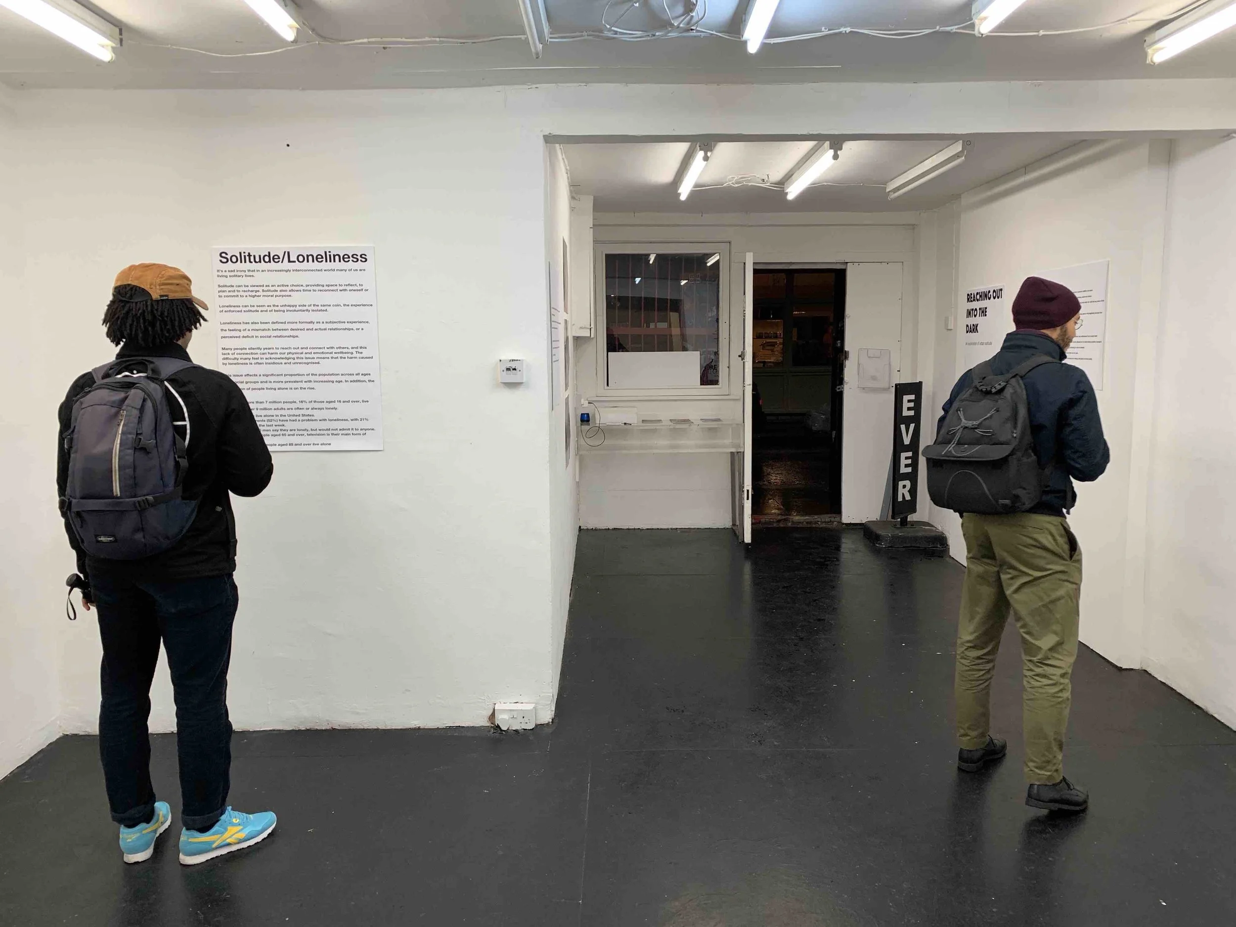
Exhibition visitor reading text

Exhibition visitor reading text

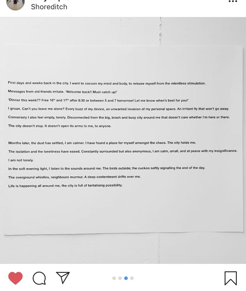
It was interesting to see then, that exhibition visitors seemed to respond in equal measure to the text as well as the photographs. There were a number of people who took pictures of the writing and posted to social media for example, demonstrating that they’d received the text on an equal footing to the images rather than as a narrative sidekick. This response again confirmed the benefit of staging an exhibition, as providing an alternative way to present the work and allowing it to be received and interpreted differently.

Exhibition visitor posted text on Instagram following the private view

Exhibition visitor posted text on Instagram following the private view

Another element that I experimented with during the exhibition was of combining triptychs to create larger narratives. These groups of six photographs came about when planning the exhibition layout on my computer and realising that grids of images gave the work a different feel again. Having two portraits in each group suggested potential relationships between people that were not seen in a single triptych. This was quite fun to play with and the typical response from visitors to the exhibition was of trying to make connections when confronted with the six images, which kept them engaged for longer and forced them to reflect more deeply on what they were seeing. These 6-image grids were the most talked about element of the exhibition without doubt, and the aspect that provoked the most questions from visitors. 

6 image grid on show at the FMP exhibition

6 image grid on show at the FMP exhibition

It was really satisfying to get direct feedback on the mode of presentation, when the viewer was finding a single or multiple implied stories, but was not able to satisfactorily resolve them immediately and was thus provoked to ask a question about the work. Having viewers arrive at widely varying interpretations of the same set of images was even better!

Overall then, I believe that the decisions to present the work in triptych and alongside text were both successful at this stage of the project. It is possible that as the work continues and the range of responses to the issue increases, these decisions may no longer serve the best communication of the themes and I would be happy to concede them as they are by no means non-negotiable. As stated previously, I feel that there’s still a long way to go with this project and the work will no doubt change course again before reaching its natural conclusion. As I look ahead, I anticipate the addition of video to the work as well as a wider variety of scenes and portraits but there will almost certainly be other unexpected developments and I look forward to steering a course into the future.
Final Major Project: Reaching Out Into The Dark Exhibition, November 2018

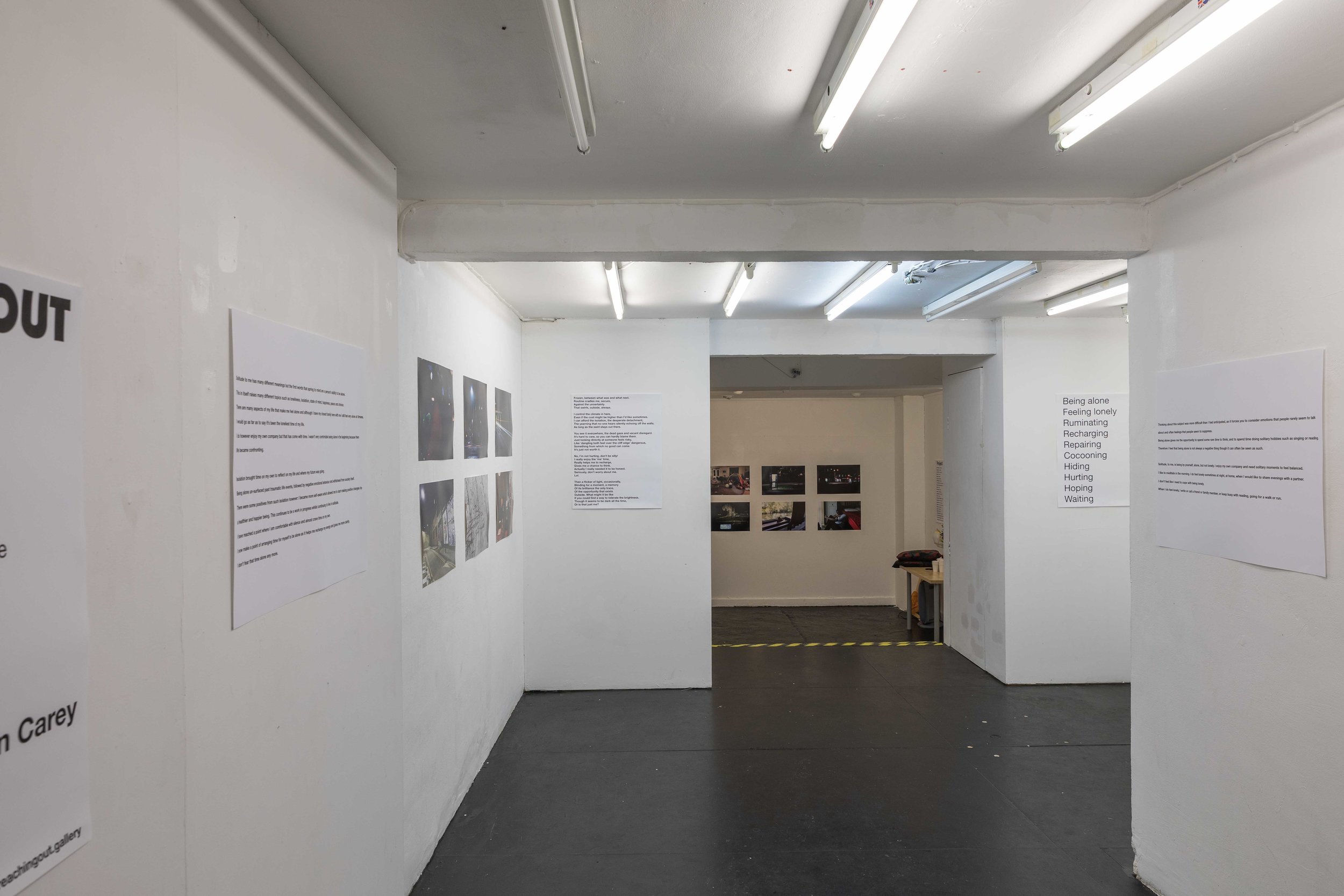
The ROITD FMP exhibition took place this week, November 27th and 28th, at studio1.1 gallery on Redchurch Street in Shoreditch, London. The decision to actually hold an exhibition was only taken earlier this month, so pulling it together from conception to opening occurred in the space of 19 days.

studio1.1 London gallery

studio1.1 London gallery

The progress of the work during this FMP period has been slow and hindered by outside factors, such that I initially felt that trying to hold an exhibition would prevent me from focusing enough time and energy on actually having enough work to submit by the December deadline. I was also discouraged by preliminary enquiries into potential exhibition spaces. Space hire seemed so prohibitively expensive and difficult to arrange that I figured I should concentrate on putting the work together for online presentation in the form of a project website, which I’d always envisaged as the main repository of the finished work.

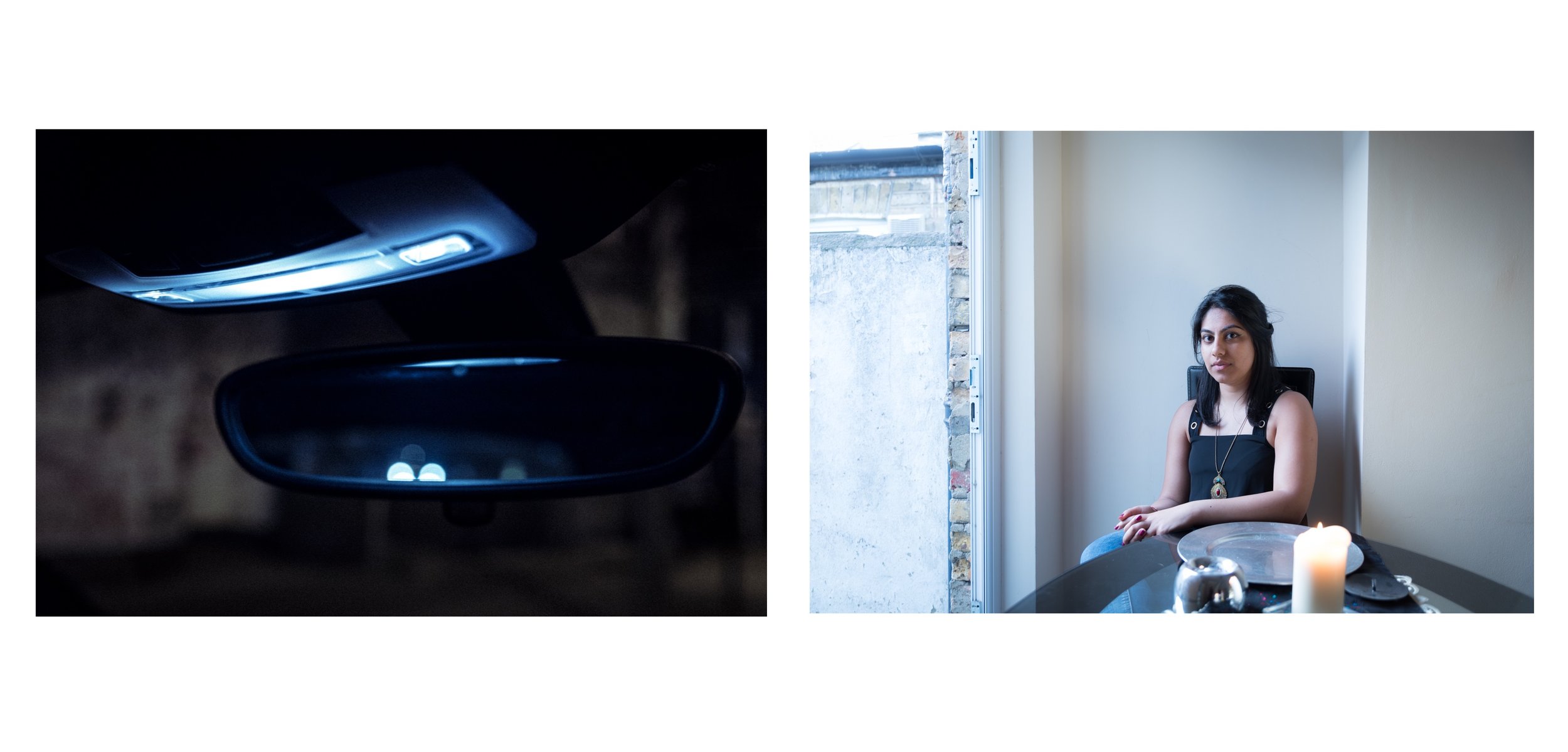
I had wanted to present the images in triptychs, aiming to suggest quite open-ended narratives, and had decided that each triptych would be anchored by a portrait. After completing a couple of portrait shoots in the last six weeks or so, I saw this vision finally begin to take shape in a way that made an exhibition now seem possible.

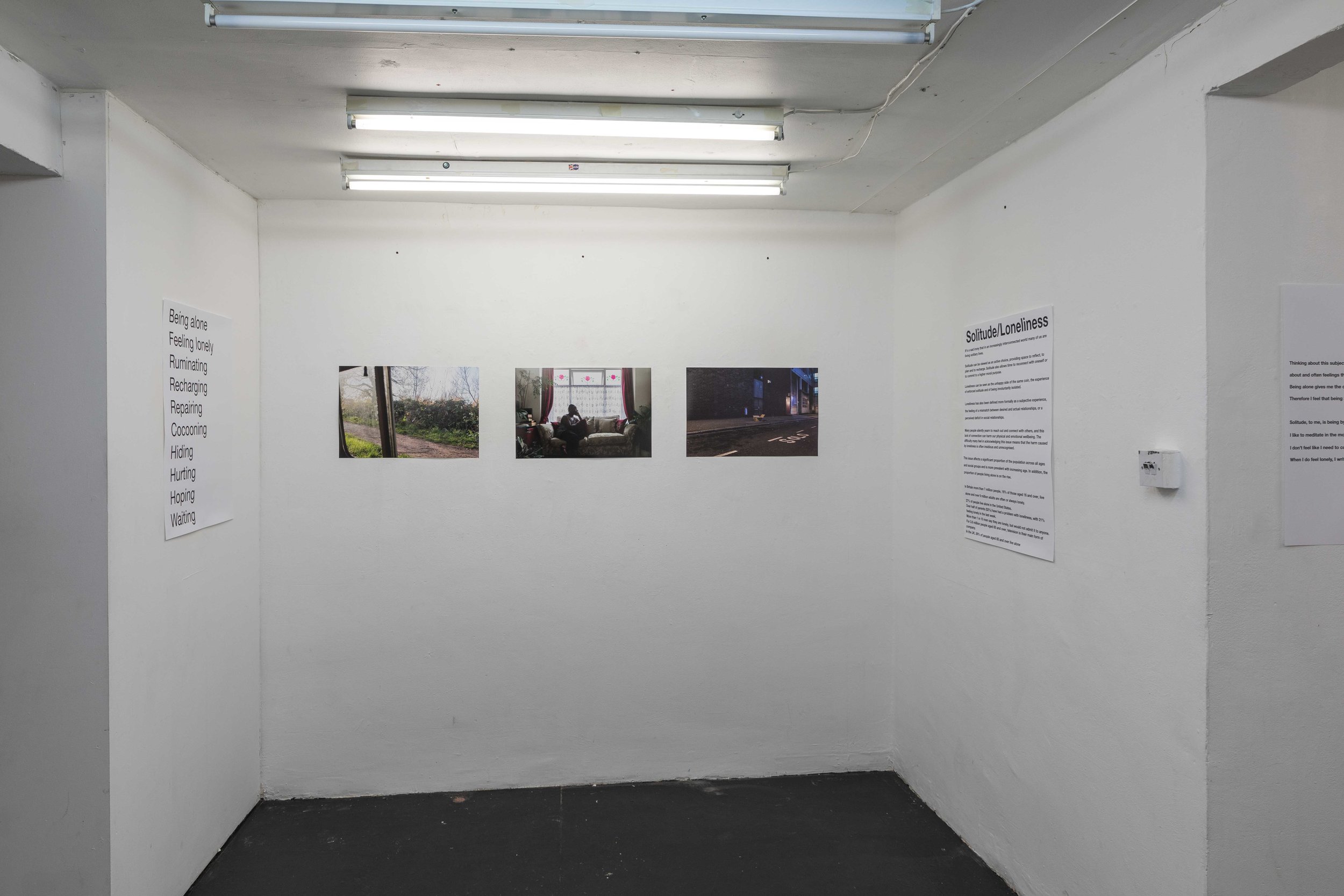
Triptych

Triptych

Additionally I was encouraged by a conversation with tutor Wendy McMurdo, an incredibly accomplished artist in her own right, who seemed to confirm that the work was heading in the right direction and encouraged me to keep pushing forward. She perfectly understood the internal conflict that I was having – ‘that’s the artistic process Justin’ – and this reassured me that I wasn’t going crazy and that I could possibly pull it off after all. 

I also realised that without an exhibition I’d be missing a great opportunity to engage with the audience, to ‘reach out’ as I had always been aiming to do with the work. Reflecting on this aspect of the exhibition is something that I’ll discuss further in another CRJ post.

So, once decided upon, it was key to find a space to show the work. I was really fortunate that studio1.1 were able to accommodate me for two days at the end of November at a discounted rate that was within my budget. I had enough time to pull everything else together and also make more work, which at the time of deciding to have an exhibition was still necessary.

The initial plan was to show 12 to 15 images, but it quickly became clear that to do so would not allow me to articulate the idea well enough and would also not fill the space that the gallery afforded. The final exhibition consisted of 18 images presented with accompanying text panels taken from the project research, as well as some additional contextual information about the issue of urban solitude and loneliness. 

Following on from my recent experience with the Shutter Hub Open, I explored the possibility of using newspaper for the printing and made enquiries with Newspaper Club about the papers and sizes available. The price to print on newspaper was certainly very attractive compared to my usual printer Digitalarte (approximately 10 times cheaper!) but once I was clear about which images I wanted to show and considering the subtlety of tonal variations and deep shadow in many of them, I ended up going for the tried and trusted, and much more expensive fine art method. 

Once the space was secured I started promoting the exhibition via Instagram and Twitter and received a number of tentative responses suggesting that people were interested and planning to attend. The private view was held on the evening of Tuesday 27th and I’m really happy to say that it was well-attended.

Visitors at the Private View on 27th November 2018

Visitors at the Private View on 27th November 2018

The show ran for two days, 11am to 6pm on both days, with the private view from 7 to 9pm on the first day. I would have ideally held the exhibition for longer, but the gallery only had two free days available and it was difficult enough getting time off work for this period as it was. All in all it worked well, allowing those who expressed an interest in attending to do so. I was really gratified that people travelled from outside of London to see the exhibition and the feedback was generally really positive, which validated the expense and effort that had gone into putting the show on. 

Overall, I’m really glad that I made the effort to arrange an exhibition. It was an incredibly valuable learning experience, both in practical and organisational terms, but also in terms of helping to better understand how to present work to attract and engage an audience, what considerations are important when planning what one hopes will be a successful show, as well as helping me to gain a better understanding of how different outputs can connect differently with audiences and thus how to more strategically present one’s work in order for it to have the maximum reach and impact. 

I will write more about my reflections in this regard in a subsequent post. 

Informing Contexts: T-shirts make the dream work!

Towards the end of the previous module I’d experimented with putting an image on a t-shirt, firstly to see how it would look and also to consider whether this might be another way to share and potentially market my work. I’d taken inspiration from Juno Calypso, who successfully blends a critically-acclaimed fine art career with a more accessible commercialism, selling a range of posters via her website.

Posters available via Juno Calypso's shop

Posters available via Juno Calypso's shop

To this end, I set up a limited duration campaign on Everpress offering print t-shirts in four colours in the period just after new year, and promoted them via my Twitter and Instagram accounts. 

The range of t-shirts offered during the promotion

The range of t-shirts offered during the promotion

It’s fair to say that the response was…terrible!

The way Everpress works, you’re required to stipulate how many items must be sold in order to trigger the shirts being printed. The t-shirts are then only printed at the end of the offer period, if the minimum number of orders is reached. If the minimum orders is not reached, those who have ordered are refunded and your campaign is consigned to the sad list of losers (maybe that last part isn’t totally accurate!). 

Having set a minimum order of 5, I was sadly unable to convince 3 people to buy a t-shirt (I bought two myself!), with only one other item purchased. 

Despite being on the face of it a crushing failure, I learnt quite a few things from this experiment: 

  • People on social media are not as engaged as they might seem. The numbers of people who viewed the Instagram stories and favourited the posts related to the t-shirts did not translate into traffic to the Everpress website (the site helpfully gives you data about number of page visits etc). It’s interesting to reflect on how to consistently turn a social media following into active engagement outside of the immediate social media platform, whether that be to promote a project, convince people of an idea or turn followers into purchasers. I am sure there’s a lot of information out there about how to do this better. It would be wise to take a more strategic and informed approach to selling on social media if this was ever to become a significant income stream.

  • Pricing is obviously key. I set the price of my t-shirts at £19.99. The cost of producing each shirt was around £12 due to the low number of predicted sales. There’s certainly a discussion to be had about value and how this relates to exclusivity and desirability of the product on sale. Speaking to a friend of mine who enquired about how the sales had gone, she interestingly said that she was put off from buying as she felt the price was too high compared to the equivalent item she usually buys on the high street. This raises another question about the context of the sale and where you seek out your audience. Using Juno Calypso as an example again, it’s probably easier to convince a visitor to her slick website, that showcases her work to best effect and reinforces the impression of it being high concept art, to part with £50 for a poster than it might be if she were trying to find the same customers via Twitter. In the first case the customers have somewhat self-selected. Of course, I could have simply listed the t-shirts for a few pennies over their cost price. I’m not sure this would necessarily have resulted in any more sales. It would also have done little to affirm the value of the work, which is of course a complex concept in itself and not one that is solely dependent on my view of the matter!

  • I really don’t enjoy self-promotion and find marketing decidedly uncomfortable. My efforts to drum up interest in my t-shirt campaign were lacklustre I have to admit, and basically amounted to one post on Instagram and a couple of Instagram stories, as well as a couple of posts on Twitter. Even this felt horrible! I have to consider what the root of this discomfort is and whether it would make future attempts at self-promotion or product selling impossible. It’s difficult to expect anyone to buy your product if you’re not enthusiastic and passionate about it yourself. 

  • Trying to sell t-shirts in winter when it’s snowing is stupid! (Maybe this partly explains my sheepish marketing…)

Overall, this was a valuable thing to do. I’ve not been completely deterred from doing something similar in the future, and I would hope to have a slightly more successful outcome by applying the lessons above. It’s worth considering how much of one’s income can ever be from selling these sorts of products, if my career heads in the direction I’d like it to. Equally though, the underlying principles of marketing, audience engagement, understanding your customer and what they want etc. are all skills a successful photographer must master.

So, anyone for a t-shirt?

Sustainable Prospects: Week 3 Reflection

This week, the focus has been on the challenges and opportunities afforded by the ever-increasing importance of digital image capture and image distribution platforms. We were set the task of devising a targeted social media strategy to increase our Instagram following by 30 or more followers over the week. This challenge felt particularly uncomfortable for me, as it requires me to explicitly acknowledge the fact that I have a desire and obligation to engage with my audience and thus to strategise the best way to achieve this. This feels instinctively inauthentic and contrived, which is not how I ever envisaged my photographic practice and not how I would wish to view myself. 

My Instagram homepage

My Instagram homepage

Since the start of this module I have been wrestling with this idea of professionalism and what that actually means, in practical and tangible terms. What does it mean for me to call myself a ‘professional photographer’? What behaviours and qualities do I have to demonstrate to be worthy of that title and to be able to meet the expectations of others who might engage me on a professional basis?

A lot of this conflict comes, I think, from a self-image that possibly doesn’t allow me to properly accept that I might be good at something or that I might wish to become good at it. It seems almost too boastful to call myself a ‘professional photographer’ and somewhat presumptuous to conduct myself as if I were one. There’s an inherent contradiction of course in that last statement, in that I am in the middle of an MA in photography so have already attained a certain level of competence and to progress from where I am now requires, actually probably demands, that I embrace the idea of professional practice and decide how best to operate within this new unfamiliar world. There is also the contradiction of shying away from the idea of professional or outward-facing practice while maintaining a website and social media presence that essentially only makes sense in the context of engaging with others and providing me a means to show my work to the world. Lauren Cornell’s (2015) words certainly cut right to the heart of this conflict:

“But social media, in its omnipresence and ubiquitous use, has become a main site for the contestation of identity and the self—a new arena that repeats and extends previous eras’ questions of visibility and self-definition, and begs for artistic challenge.

Hardy said she took the portraits only for herself without caring who might see them. “Only for me” now seems an outmoded or rare sentiment in a culture in which personal archives accumulate in public, not in bedrooms or on dusty hard drives.

When we take photographs today, we always care about who, besides us, might see them.”

Lauren Cornell, 2015

The final sentence there really hit home. It seemed almost impossible to run from this fact, that we always care about who might see our photos. This being the case, it then seems ridiculous to avoid an honest and thoughtful look at how we connect with our audience and who we believe, or would like, our audience to be. The next step from there is, inevitably, to decide on a strategy to achieve this audience connection in the best way possible.

So I’m back where I started.

Having accepted this reality but not yet being comfortable with it, I decided to instead update my website. This is something I have been meaning to do for some time, but had been avoiding for various reasons. 

Old website homepage

Old website homepage

I set about drafting an outline of what I wanted my new website to look like and searched around for an appropriate template that would fit my requirements. Once I started down this route, I faced a number of other technical and philosophical questions about website provider, domain names, how much I felt it was worth investing in getting a website that looked good and functioned well and what I was really trying to achieve with my website – did I just want a nice looking portfolio, did I want to represent myself in a professional manner to potential paying clients etc.

While it’s not necessary to articulate those decisions here, the act of thinking these things through has helped me understand what I’m trying to achieve with my work, what I thus need to try and get out of my MA studies and where I might want to go next. I have also accepted that I need to generate at least a rudimentary social media strategy and will thus get on to this as my next task now that the website is complete. 

New website homepage

New website homepage

For me, the key thing to reconcile is the desire to take photographs simply for my own pleasure, which is what drove me initially, with the present need to progress through my MA and to position myself for a post-MA world in which I hope to be able to practice as a photographer in some way or another.

“Once the world has been photographed it is never again the same. (This is where Eve and the Apple come in.)

Once the images begin to replace the world, photography loses much of its reason for being.

Into the vortex, then, comes the digital.”

Fred Ritchin, 2010, p23

I don’t want to lose sight of the world with all its complexity, nuance and beauty in the rush to create a well-strategised digital façade, however I concede that I must engage honestly with the digital world and its possibilities and will aim to do this in a more thoughtfully structured manner going forward.

References:

  • CORNELL, Lauren. 2015. ‘Self-Portraiture in the First-Person Age’. Aperture, Winter 2015, Issue 221, p34-41.
  • RITCHIN, Fred. 2010. After Photography. London, New York: W. W. Norton.