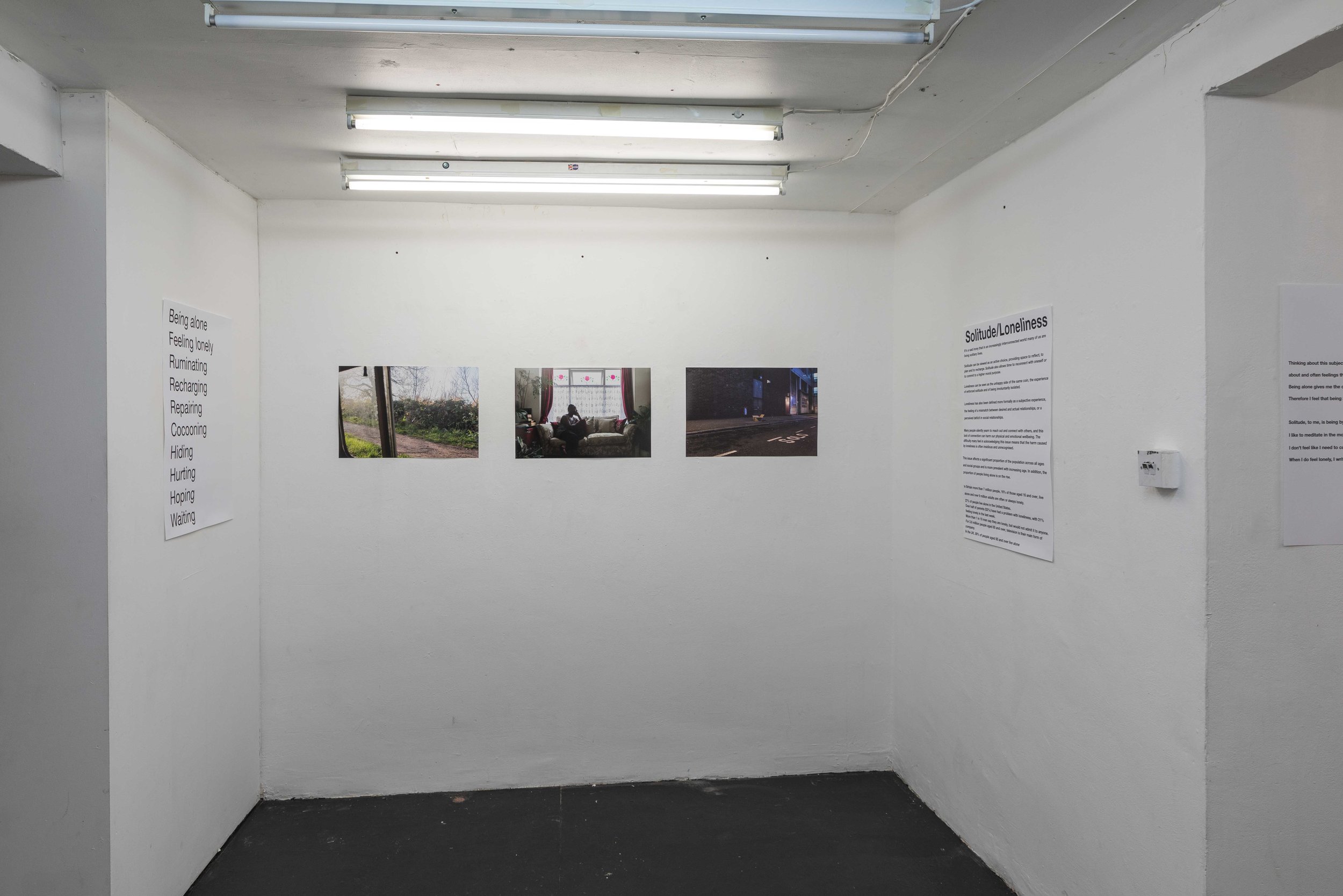
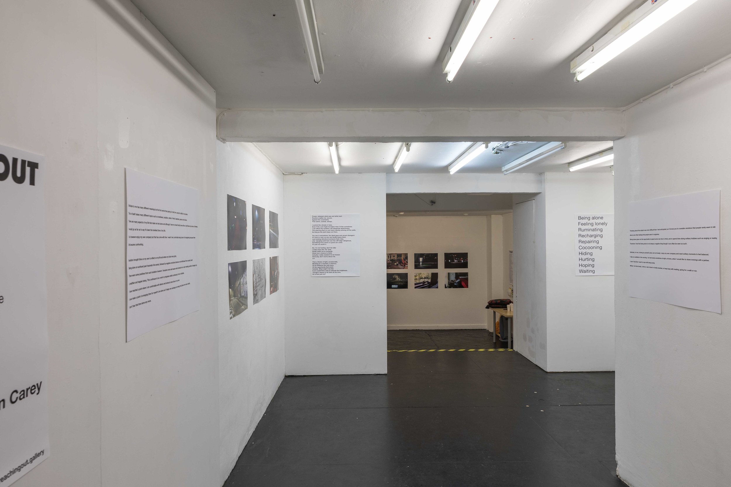
Early on in the planning of the potential outputs for this project I envisaged a website as a significant, and possibly the most important, outcome of the FMP. As the FMP period continued and the chances of staging an exhibition appeared to recede, I further concentrated my focus on producing a website to display the work and which could serve as a hub from which the project would continue to grow and deepen post-MA.
I had purchased a suitable domain some time back in preparation for building the website, but only began outlining how I wanted the site to develop in the last month or so as the project and the planned triptych format started to take shape.
The aim was to produce a visually interesting and informative website, that would be able to provide a deeper experience than available at the exhibition. In keeping with the breadth of responses to the themes of this project, I was keen to present information in a range of formats –
· factual information and links
· contextual information about the issue of urban solitude/loneliness
· interview excerpts from those who’d collaborated in the project
· creative writing from collaborators and myself
· songs that respond to the theme
Due to the multi-format nature of this information I was confident that a website would be a perfect platform for presenting the work. The challenge was to do so in a way that was engaging without being overly dry, or that took the emphasis away from the images.
Example of a page from Raphaël Dallaporta’s work Domestic Slavery from artist’s website
Useful references for this work included Domestic Slavery by Raphaël Dallaporta and Imperial Courts by Dana Lixenberg. These two examples showed that communication of the themes and message of a project could be enhanced and its impact amplified, by accompanying text (Domestic Slavery) and that a multimedia presentation can result in a richness and depth of coverage of a theme that isn’t possible using still images alone (Imperial Courts).
These projects, particularly Imperial Courts, were exemplars of the sort of treatment I was aiming for with my own website. I have always felt that this project will not have been fully explored without film, more creative and investigative writing and potentially full interview transcripts also being presented alongside the photographs. This deep exploration of a theme really appeals to me, as it allows me to continue my enquiries following completion of the MA and also because the scope of this topic is so broad as to almost demand more than the 6 month treatment available during the FMP.
As the image-making started to come together, so the potential website layout also became clearer. I was thus able to start building the website at the beginning of November, using placeholder images to give a sense of what the eventual layout would look like and how the text would relate to the pictures in the final presentation.
I was fortunate to be able to draw on some rich textual material from my contributors and the beginning of the website build coincided with further written submissions. I’d also been working on some writing of my own which continued alongside the website draft. November was thus a busy month of more shooting, website planning and building, writing and exhibition planning and I was pleased with the progress I was able to make in a short time.
Once the date of the exhibition was decided, I aimed to have the website ready to publish on the day prior the exhibition. This was to act as a primer and public introduction to the topic and would also be available to support the physical exhibition (e.g. I was able to refer exhibition visitors to the website for more information and images when meeting them at the gallery).
Text presented alongside images on the project website
At time of launch, the website consisted of 36 images in 12 triptychs. Each triptych is presented with an accompanying text excerpt. The text being of varying length and type (interview transcript excerpts, creative prose or poetry) and in some instances chosen to seemingly reinforce the putative theme of the triptych and in others to challenge it.
The website also includes information and statistics about the issues of solitude and loneliness and the emotional and psychological impact it has. In addition, the website includes contact information for agencies that are somehow related to this issue.
Information about solitude and explaining the project in more detail on project website
The reaction from people who’ve visited the website has been very positive. I have received comments on the images, the impact of their presentation alongside text, the usefulness of the information that adds context to the topic and the value of including contacts to helpful organisations.
I’ve been gratified to hear from a number of people that the work on the website has moved them emotionally, including a couple of visitors who have been moved to tears by the work. This was pleasing to hear from the point of view of confirming the success of a key project aim, that of engaging with the viewer’s emotions and producing work that carried an emotional weight. Again, I feel this was more successfully achieved by combining text and images than would have been achieved simply by images alone.
Links to relevant organisations on project website
The website has also acted as a starting point for dialogue with people who are themselves interested in investigating this issue and with agencies who are already doing so. I have been able to refer them to the website for a quick appraisal of where I am with the work so far and what my standpoint is, and this has been a great platform from which to discuss potential collaborations or to launch ongoing dialogue about the issues involved.
Overall then, I would say the website has been the most successful aspect of the project, because of its permanence and the fact it will allow the work to be visible and accessible in a way that suits the viewer. Based on the responses I received during the exhibition, there’s also likely to be a benefit from the ability to engage with the work online anonymously and at one’s own pace, my suspicion being that people are more comfortable engaging with and reflecting on this work when they feel under no pressure to react to it for an external observer or where they are not in danger of having a potentially emotional response noted by someone else.
In the near future I aim to add a short movie to the website, as well as more transcripts from recent interviews that were conducted just prior to the website being published. I will also continue to add images as the project continues in the weeks and months ahead.


