Final Major Project: Future Directions

The end of this module and the MA course has arrived so quickly. With my head still spinning from the whirlwind of activity that preceded and encompassed the exhibition and website launch it is difficult to rationalise what might come next. 

I was surprised to be asked a number of times at the Reaching Out Into The Dark private view“So what’s next Justin?”, and as the reality that I’m soon going to be a former student starts to sink in, I’m obliged to start trying to come up with some answers.

Visitors to the ROITD Private View

Visitors to the ROITD Private View

Here is what I have so far:

Project

The work so far in this project feels very provisional, like only a surface scratched, with the FMP outcomes simply demonstrating the potential audience for the work and also how many more facets of this theme there are to uncover and explore. 

I’m proud of what I’ve achieved so far but already have a clear idea of the next few steps for the work, visually, which include:

·     The urgent need to include older people in this work. This is especially important as I’m confronted with lonely older people every day in my job, such that it feels almost criminal not to give them a platform in this project and a prominent one at that! There is also the need to represent younger people (adolescents mainly) and finding a way to reach this group and engage them with this work will be a future challenge no doubt.

·     A need to better represent the internal world of solitude and loneliness, both with more images of interior spaces, and by finding an effective way to visually depict the internal emotional landscape. I think my work already does this to some degree (hopefully), it certainly reflects my own internal emotional landscape in a sense, but there are a variety of emotional responses to this subject (not all of them negative of course) that would be really interesting states to explore photographically if this could be done in a manner that wasn’t too obvious and was based on a coherent visual strategy. My initial goal had been to explore solitude, this gradually evolved to me wanting to explore solitude and loneliness as I started to research the theme and understand the topic more. This further developed into a desire to better represent the positive aspects of a solitary life. Latterly though, I’ve thought a lot more about specific scenarios and how they could be explored, such as feeling alone despite being in a relationship, or the feeling of being alone among a large throng on a busy street in rush hour – all these experiences that are broiling away internally but which may never be discernible on the external surface of our persona, yet have a profound impact on the way we experience the world and relate to each other. This is a really interesting area that I am keen to explore further. I’ve been thinking a lot about this since the exhibition concluded and it might even be separate project, or sub-project, as the potential ground to cover is vast.

My internal emotional landscape?

My internal emotional landscape?

·      I also want to examine the role that technology plays in our modern solitude. There’s an irony that while we were all sold these devices as ways to better connect with each other, we spend most of our time now experiencing daily life with our heads down fixated on a small screen whenever we are out in the world, such that the happenings of the world around us and the existence of other actual humans is no longer necessarily a vital part of our daily experience in the main. We thus live a voluntary solitude, detached from each other and hypnotised by our personal mini computers. It’s not clear whether these were the intended consequences of these devices but this is the reality we are faced with and it’s interesting to consider what that means for our emotional and mental health and what it means for our wider communities and societies. 

·     Reconsideration of the outputs and how best to use them is another element that can further progress the aims of the project. I’ve learnt a number of useful practical lessons during FMP, particularly from putting together an exhibition. Reflecting on the aspects of the planning that worked well and what things I’d wish to do differently in the event of a future exhibition is important learning to take forward. I’m also more convinced of the need for a book as an eventual output for this work. I arrived at this conclusion after seeing the work take shape during the website build and getting a clearer understanding of how the interaction of text and image might work to successfully communicate to the viewer on a page as well as a screen. Continuing to refine and mature the work over the coming year or two will gradually make a book project seem like a foreseeable future milestone of the project I believe and will offer yet another way to present and experience this work.

Considering one of the aims of this project is to stimulate dialogue and help to facilitate discussion about the experience of loneliness and solitude, I’ve always been keen to find a way to take the work outward in the form of a workshop. This had formed part of an (as it now seems) ambitious FMP project proposal, but it remains an important pillar of what I would consider to be a fully realised project.

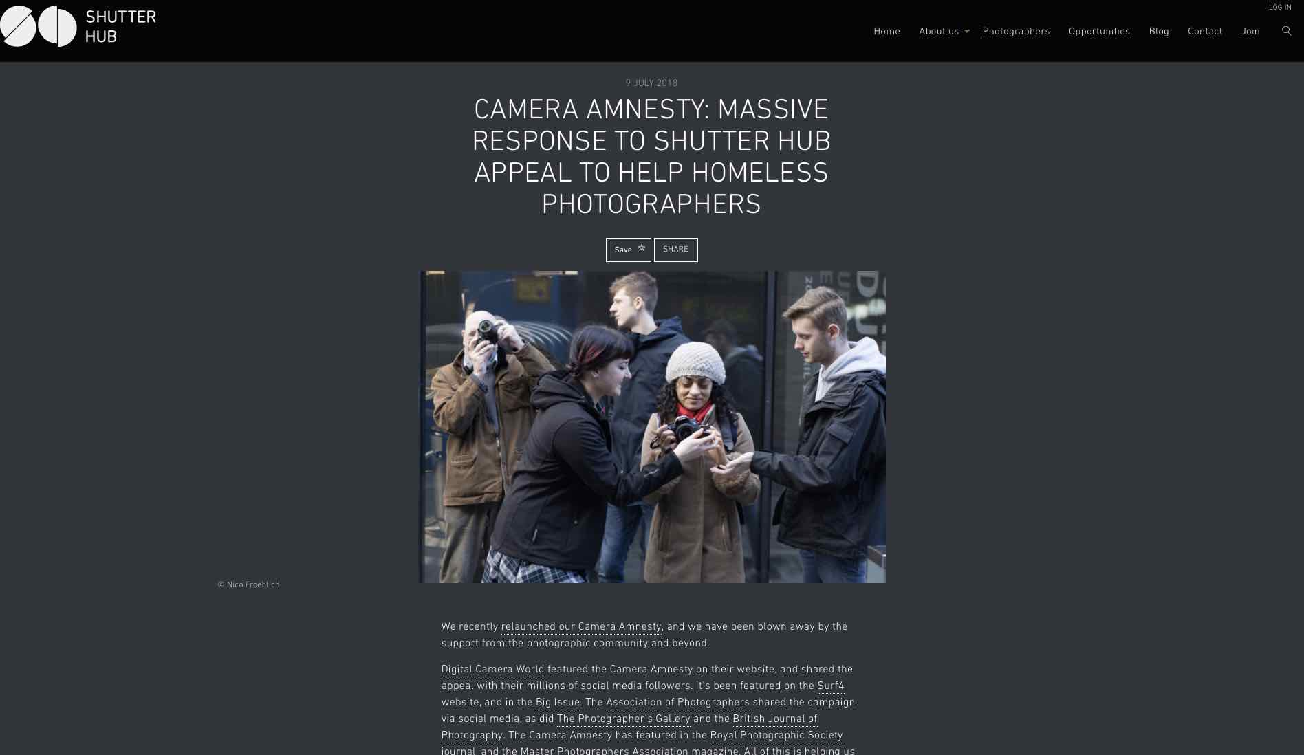
Shutter Hub’s Camera Amnesty campaign to help homeless photographers

Shutter Hub’s Camera Amnesty campaign to help homeless photographers

To that end, I’ve already made initial contact with Shutter Hub, an organisation that has a lot of experience of delivering talks and workshops, about how we might collaborate to bring this work to a different audience in that format. Shutter Hub have already been working with potential target groups in their own outreach work and so it would be a potentially mutually beneficial collaboration that would align with their existing corporate activities. 


Practice 

Moving forward I have to consider how I will balance my photographic practice with imminent changes in my job, working pattern and place of abode. The MA has given me a much better understanding of how to approach trying to communicate through photographs and associated/accompanying media, as well as a grounding in how to carry out research to support one’s visual aims. I’ve also learned practical skills that will benefit my practice and my ability to connect and collaborate with other practitioners. The aspects of my practice that I will be concentrating on in the immediate post-MA future are likely to include:

·     Continued regular contextual research to support the ongoing progress of this project but also to provide the basis for potential future work of a different nature. It’s not always possible to directly quantify how the research done contributes to the final work but it certainly does, and this is one of the aspects that sets my current work apart from what I was producing before starting this course. My work now is supported by extensive research of visual and written media and prolonged reflection, whereas before I was just taking photographs that interested me for no clear reason. That’s not a bad thing in itself of course, but I can say that the work I’m producing now is a more eloquent expression of my ‘voice’ than anything I produced previously. This is only due to the research and consideration which underpins it and thus I look forward to further clarifying my voice with ongoing research and learning.

·     Writing will become an increasingly important element of my practice moving forward. I very much enjoyed writing for this project, in the process reawakening an interest in creative writing that I’d had in my much younger days. While continuing to write more critically during the course as well as book reviews elsewhere, I envisage less constrained writing being a larger proportion of my future output. I’ve found writing to be a good way to synthesise my reflections and the conclusions I’ve made about the work I’m doing, and so the writing serves to further my thoughts and offer another conduit to connect with the emotions that I always want to bring to my work. Thus, in the time that’s freed up after the completion of the MA I intend to take a writing course to help develop my competence in this area and will continue to write at every possible opportunity. 

Excerpt of my review of Robert Hirsch’s book Seizing The Light on Amazon

Excerpt of my review of Robert Hirsch’s book Seizing The Light on Amazon

·     Another aspect of my practice that I will be concentrating more on in the future is networking and self-promotion (horrible as that sounds!). The exhibition cemented the importance of this for me, as the private view was attended by a number of people who became aware of me on social media. Edo Zollo, a photographer I’ve looked up to for years, was kind enough to visit my private view and stated that he’d been following me for years and that I was one of his favourite photographers. This was very surprising and obviously great to hear, but it also highlighted the importance of presenting yourself online. He’d never have heard of me otherwise and it’s currently the best way to connect with your audience, communicate your motivations and describe your practice in ways that people will hopefully identify and engage with. I saw this in action during this FMP and I have to take this aspect of my practice more seriously if I hope to reach a bigger audience, position myself for future professional opportunities and connect with potential collaborators. I’m by no means comfortable with what can at times seem like relentless self-promotion but I have to find a happy medium where I’m regularly nurturing this audience of supporters and steadily adding new followers as well, people who are supporters of my practice in one way or another. There is a lot to learn too about how to promote and market specific events. My exhibition only came together at very short notice, so it wasn’t possible to build a solid buzz about it with a long lead-up. In future, the planning of the exhibition will take better account of what’s needed to promote it effectively to give it the best possible chance of success. These practical lessons are one of the most useful takeaways from the MA course for me. Being an artist is great, the licence to stay in your head where dreams live, the onus to be creative, to challenge conventions and to bravely explore new territories. Yet there is no escaping the practical realities involved in researching, producing and promoting the work. I’ve learnt some of these realities first hand (my credit card can certainly give you some chapters about the harsh realities too!) in these final weeks and have a more pragmatic appreciation of what is required to continue making good work, that people will want to see and possibly support, in the future.

Final Major Project: ROITD Website Outcome

Early on in the planning of the potential outputs for this project I envisaged a website as a significant, and possibly the most important, outcome of the FMP. As the FMP period continued and the chances of staging an exhibition appeared to recede, I further concentrated my focus on producing a website to display the work and which could serve as a hub from which the project would continue to grow and deepen post-MA.

I had purchased a suitable domain some time back in preparation for building the website, but only began outlining how I wanted the site to develop in the last month or so as the project and the planned triptych format started to take shape. 

The aim was to produce a visually interesting and informative website, that would be able to provide a deeper experience than available at the exhibition. In keeping with the breadth of responses to the themes of this project, I was keen to present information in a range of formats – 

·      factual information and links

·      contextual information about the issue of urban solitude/loneliness

·      interview excerpts from those who’d collaborated in the project 

·      creative writing from collaborators and myself

·      songs that respond to the theme

Due to the multi-format nature of this information I was confident that a website would be a perfect platform for presenting the work. The challenge was to do so in a way that was engaging without being overly dry, or that took the emphasis away from the images.

Example of a page from Raphaël Dallaporta’s work Domestic Slavery from artist’s website

Example of a page from Raphaël Dallaporta’s work Domestic Slavery from artist’s website

Useful references for this work included Domestic Slavery by Raphaël Dallaporta and Imperial Courts by Dana Lixenberg. These two examples showed that communication of the themes and message of a project could be enhanced and its impact amplified, by accompanying text (Domestic Slavery) and that a multimedia presentation can result in a richness and depth of coverage of a theme that isn’t possible using still images alone (Imperial Courts). 

These projects, particularly Imperial Courts, were exemplars of the sort of treatment I was aiming for with my own website. I have always felt that this project will not have been fully explored without film, more creative and investigative writing and potentially full interview transcripts also being presented alongside the photographs. This deep exploration of a theme really appeals to me, as it allows me to continue my enquiries following completion of the MA and also because the scope of this topic is so broad as to almost demand more than the 6 month treatment available during the FMP.  

As the image-making started to come together, so the potential website layout also became clearer. I was thus able to start building the website at the beginning of November, using placeholder images to give a sense of what the eventual layout would look like and how the text would relate to the pictures in the final presentation. 

I was fortunate to be able to draw on some rich textual material from my contributors and the beginning of the website build coincided with further written submissions. I’d also been working on some writing of my own which continued alongside the website draft. November was thus a busy month of more shooting, website planning and building, writing and exhibition planning and I was pleased with the progress I was able to make in a short time.

Once the date of the exhibition was decided, I aimed to have the website ready to publish on the day prior the exhibition. This was to act as a primer and public introduction to the topic and would also be available to support the physical exhibition (e.g. I was able to refer exhibition visitors to the website for more information and images when meeting them at the gallery).

Text presented alongside images on the project website

Text presented alongside images on the project website

At time of launch, the website consisted of 36 images in 12 triptychs. Each triptych is presented with an accompanying text excerpt. The text being of varying length and type (interview transcript excerpts, creative prose or poetry) and in some instances chosen to seemingly reinforce the putative theme of the triptych and in others to challenge it. 

The website also includes information and statistics about the issues of solitude and loneliness and the emotional and psychological impact it has. In addition, the website includes contact information for agencies that are somehow related to this issue. 

Information about solitude and explaining the project in more detail on project website

Information about solitude and explaining the project in more detail on project website

The reaction from people who’ve visited the website has been very positive. I have received comments on the images, the impact of their presentation alongside text, the usefulness of the information that adds context to the topic and the value of including contacts to helpful organisations. 

I’ve been gratified to hear from a number of people that the work on the website has moved them emotionally, including a couple of visitors who have been moved to tears by the work. This was pleasing to hear from the point of view of confirming the success of a key project aim, that of engaging with the viewer’s emotions and producing work that carried an emotional weight. Again, I feel this was more successfully achieved by combining text and images than would have been achieved simply by images alone.

Links to relevant organisations on project website

Links to relevant organisations on project website

The website has also acted as a starting point for dialogue with people who are themselves interested in investigating this issue and with agencies who are already doing so. I have been able to refer them to the website for a quick appraisal of where I am with the work so far and what my standpoint is, and this has been a great platform from which to discuss potential collaborations or to launch ongoing dialogue about the issues involved. 

Overall then, I would say the website has been the most successful aspect of the project, because of its permanence and the fact it will allow the work to be visible and accessible in a way that suits the viewer. Based on the responses I received during the exhibition, there’s also likely to be a benefit from the ability to engage with the work online anonymously and at one’s own pace, my suspicion being that people are more comfortable engaging with and reflecting on this work when they feel under no pressure to react to it for an external observer or where they are not in danger of having a potentially emotional response noted by someone else.

In the near future I aim to add a short movie to the website, as well as more transcripts from recent interviews that were conducted just prior to the website being published. I will also continue to add images as the project continues in the weeks and months ahead.

Final Major Project: Reaching Out Into The Dark Exhibition, November 2018

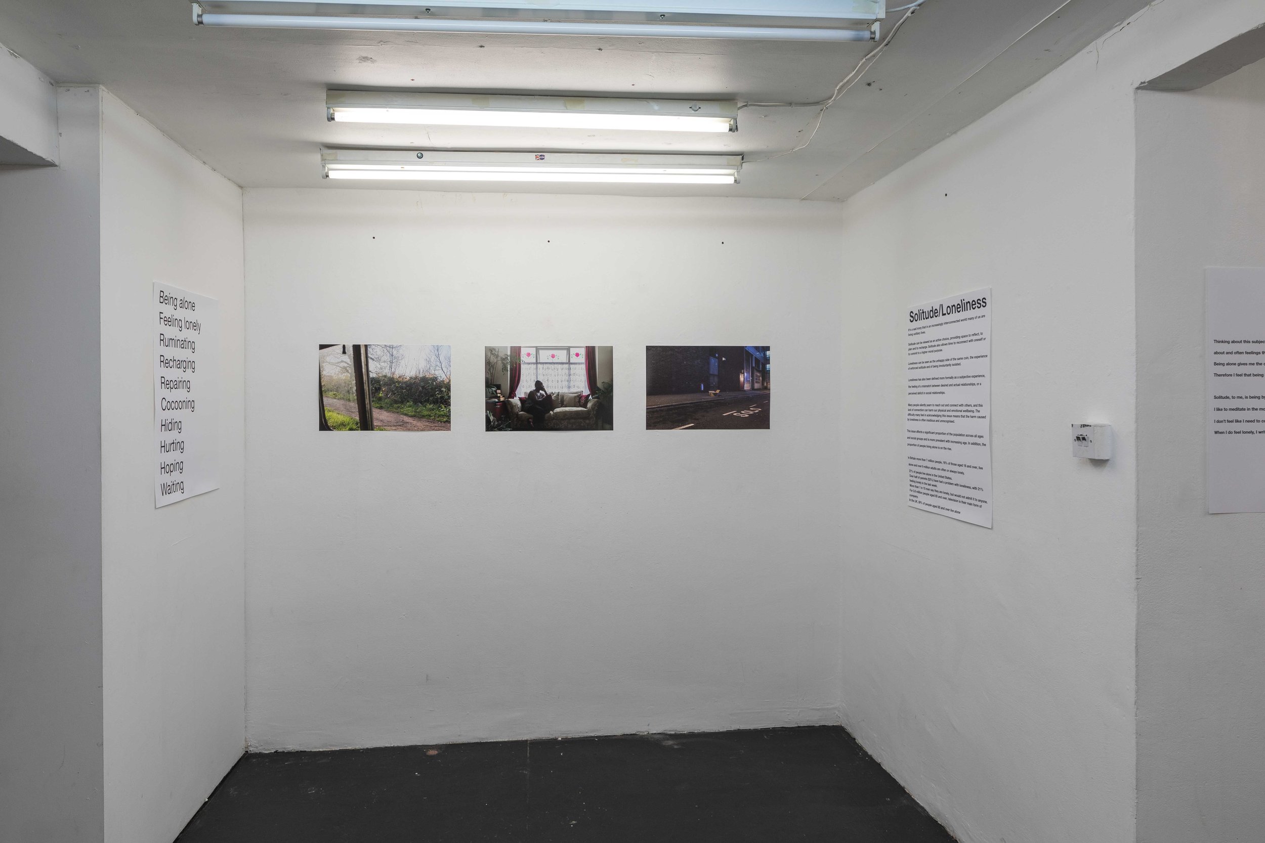
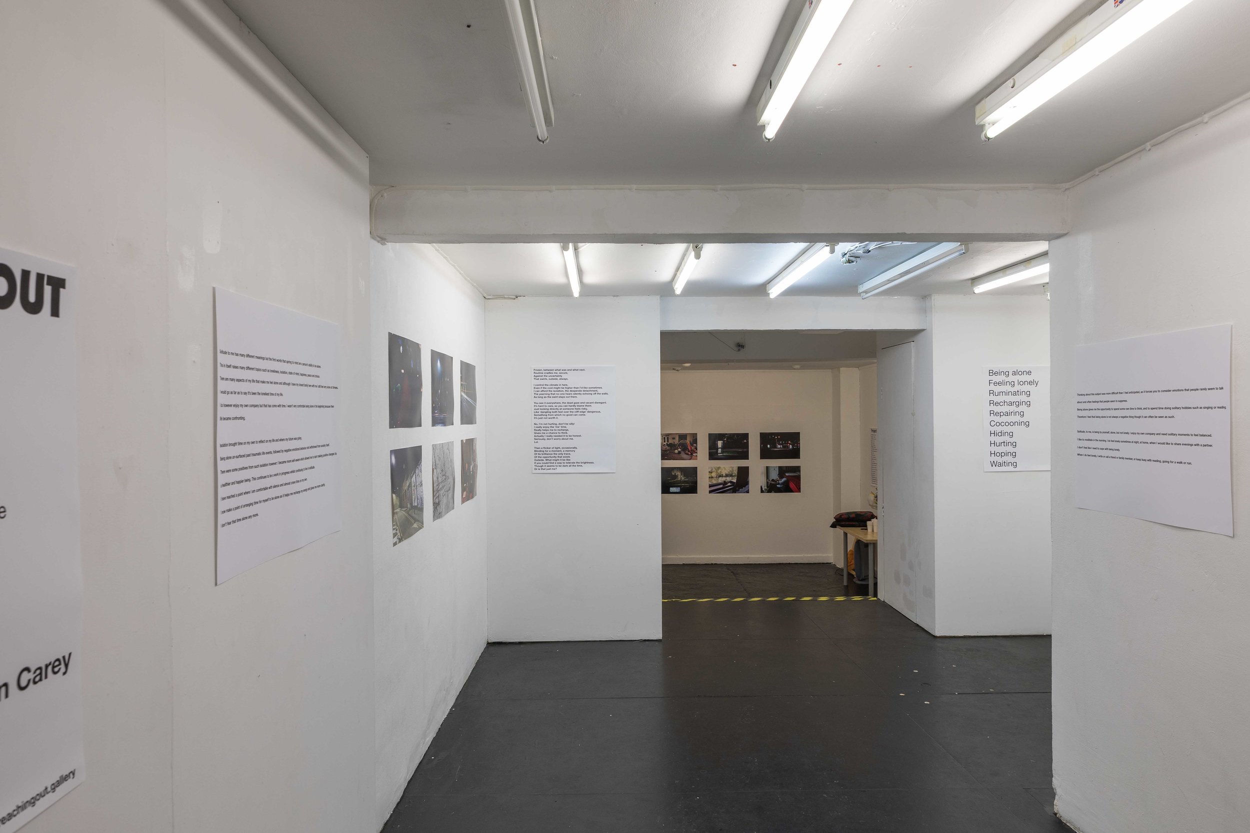
The ROITD FMP exhibition took place this week, November 27th and 28th, at studio1.1 gallery on Redchurch Street in Shoreditch, London. The decision to actually hold an exhibition was only taken earlier this month, so pulling it together from conception to opening occurred in the space of 19 days.

studio1.1 London gallery

studio1.1 London gallery

The progress of the work during this FMP period has been slow and hindered by outside factors, such that I initially felt that trying to hold an exhibition would prevent me from focusing enough time and energy on actually having enough work to submit by the December deadline. I was also discouraged by preliminary enquiries into potential exhibition spaces. Space hire seemed so prohibitively expensive and difficult to arrange that I figured I should concentrate on putting the work together for online presentation in the form of a project website, which I’d always envisaged as the main repository of the finished work.

I had wanted to present the images in triptychs, aiming to suggest quite open-ended narratives, and had decided that each triptych would be anchored by a portrait. After completing a couple of portrait shoots in the last six weeks or so, I saw this vision finally begin to take shape in a way that made an exhibition now seem possible.

Triptych

Triptych

Additionally I was encouraged by a conversation with tutor Wendy McMurdo, an incredibly accomplished artist in her own right, who seemed to confirm that the work was heading in the right direction and encouraged me to keep pushing forward. She perfectly understood the internal conflict that I was having – ‘that’s the artistic process Justin’ – and this reassured me that I wasn’t going crazy and that I could possibly pull it off after all. 

I also realised that without an exhibition I’d be missing a great opportunity to engage with the audience, to ‘reach out’ as I had always been aiming to do with the work. Reflecting on this aspect of the exhibition is something that I’ll discuss further in another CRJ post.

So, once decided upon, it was key to find a space to show the work. I was really fortunate that studio1.1 were able to accommodate me for two days at the end of November at a discounted rate that was within my budget. I had enough time to pull everything else together and also make more work, which at the time of deciding to have an exhibition was still necessary.

The initial plan was to show 12 to 15 images, but it quickly became clear that to do so would not allow me to articulate the idea well enough and would also not fill the space that the gallery afforded. The final exhibition consisted of 18 images presented with accompanying text panels taken from the project research, as well as some additional contextual information about the issue of urban solitude and loneliness. 

Following on from my recent experience with the Shutter Hub Open, I explored the possibility of using newspaper for the printing and made enquiries with Newspaper Club about the papers and sizes available. The price to print on newspaper was certainly very attractive compared to my usual printer Digitalarte (approximately 10 times cheaper!) but once I was clear about which images I wanted to show and considering the subtlety of tonal variations and deep shadow in many of them, I ended up going for the tried and trusted, and much more expensive fine art method. 

Once the space was secured I started promoting the exhibition via Instagram and Twitter and received a number of tentative responses suggesting that people were interested and planning to attend. The private view was held on the evening of Tuesday 27th and I’m really happy to say that it was well-attended.

Visitors at the Private View on 27th November 2018

Visitors at the Private View on 27th November 2018

The show ran for two days, 11am to 6pm on both days, with the private view from 7 to 9pm on the first day. I would have ideally held the exhibition for longer, but the gallery only had two free days available and it was difficult enough getting time off work for this period as it was. All in all it worked well, allowing those who expressed an interest in attending to do so. I was really gratified that people travelled from outside of London to see the exhibition and the feedback was generally really positive, which validated the expense and effort that had gone into putting the show on. 

Overall, I’m really glad that I made the effort to arrange an exhibition. It was an incredibly valuable learning experience, both in practical and organisational terms, but also in terms of helping to better understand how to present work to attract and engage an audience, what considerations are important when planning what one hopes will be a successful show, as well as helping me to gain a better understanding of how different outputs can connect differently with audiences and thus how to more strategically present one’s work in order for it to have the maximum reach and impact. 

I will write more about my reflections in this regard in a subsequent post. 

Positions and Practice: Week 12 Reflection

This week saw the submission of the two final assignments for this module, a project proposal and accompanying work in progress (WIP) portfolio. The production of this work has been quite a traumatic, but ultimately very enlightening process that will be formative for everything else that I produce moving forward on this course.
 
The difficulties approaching this work were largely due to a lack of structure in my thinking and in the approach to my own work. As I’ve mentioned previously, I’ve not really had any kind of ‘practice’ to speak of before starting this course, which should have probably been a clue that struggling through the ‘Positions and Practice’ module was a possibility! 

Project Proposal front page

Project Proposal front page

For a number of reasons I found the task of delineating a question for the proposal, explaining why it was important and proposing how my practice would be equipped to examine it unbelievably hard. Some of the reasons were bound up in my own perceptions of what a photographer is, some were a result of my sporadic practical work which in some ways inhibits creativity, while I also just felt ill-prepared for this sort of academic challenge having not previously had to write any such document.

s the deadline approached, it seemed to get harder and harder to narrow things down into a coherent idea and while all my time seemed to be taken up trying to do this, the production of practical work also suffered. My head was throbbing with pressure, and nobody ever produced anything interesting with a throbbing head! 

Speaking about the difficulties is kind of redundant now though, as the deadline passed and the work was submitted. What is useful, is to outline some of the lessons I’ve learnt from the process. 

Forgive me for introducing these in bullet-point format, it just seems kind of appropriate (nothing like a good bullet-point to make it seem like you’ve got something sensible to say!).

Proposal Lessons:

  • The act of writing a proposal is useful in itself, helping to shape up vague ideas and obliging you to flesh them out, structure them and consider how you can actually make them come to life.
  • If you can’t sell your idea, then no-one should be expected to buy it.
  • Being able to articulate what you want to get out of the work is not a bad thing. It’s not something to shy away from or be coy about.
  • Writing a proposal is a bit like a contract and a road map. In the case of these personal projects, it’s really a commitment to myself to continue working at this idea, and now I have the beginnings of a clear direction to take with the work and an idea of where I’d like to end up. None of these would have been present without writing the proposal and I have never approached making images in this way before.
  • Opening up one’s work and ideas to external scrutiny is incredibly valuable. It’s definitely daunting, but also a tool for genuine epiphanies and growth.
A draft image that didn't make the final WIP portfolio

A draft image that didn't make the final WIP portfolio

  • I have to give my work attention and the room it needs to develop. By that I mean I need to take my practice seriously. The clue really is in the name ‘practice’! I found that in the final week approaching the deadline, the act of getting out and making photographs really helped to explore and solidify some ideas, while also throwing up other ideas that I intend to explore now that the looming deadline is out of the way. I’ve spent a lot of time in this first module reading and researching, but one of the key lessons I will take away from module one is the need to put as much focus on visual research too. It really pushes the work forward. I also have to thank my classmates Chris Chucas and Rita Rodner for proving to be great examples of this in their own work throughout the last few weeks. Ultimately you need to ‘make the work and get it out there, because otherwise it’s just in your head and that’s not a good place for it to be’ as the esteemed Dr Wendy McMurdo herself would say. This is a massive lesson learned in the production of the proposal and WIP portfolio.
  • The possibilities for your work are almost limitless once you stop to really think about it. It’s important to be open to the work of other artists, to be willing to soak up ideas and to be open to collaborating with other practitioners.


Meeting the challenge of adapting to this course and the mindset required has been difficult but also great fun. I’m so glad that I decided to do this, and I’m keen to reflect on this module and put the lessons into practice.