Surfaces and Strategies: Leaflets and Zines

In my week 9 reflection I spoke a little about the process that led to me trying to put together a small zine. This was an interesting activity that I certainly intend to develop further, as there is a lot of potential for variations in content and layout, as well as technical aspects such as paper choice and printing process to explore (geeky, but I love that stuff!!).
 
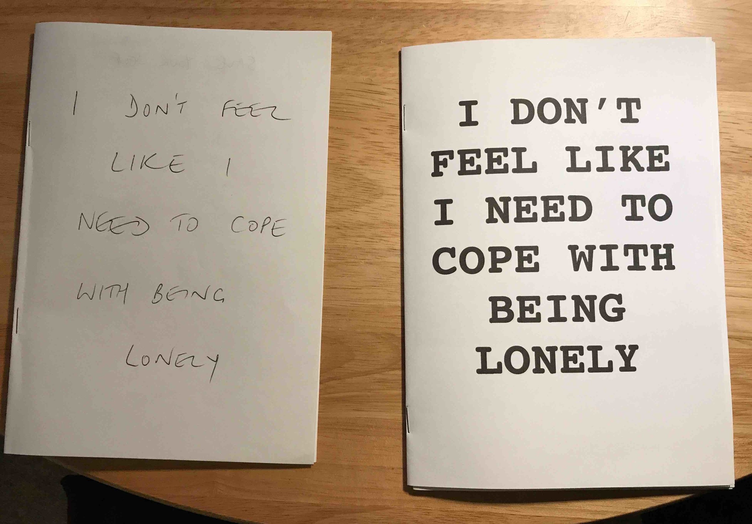
Having had access to a double-sided printer this week, I was able to create slicker editions of the zine that reproduced the photographs in a much more pleasing manner than my home printer had done. 

Zine printed on a better printer than my Canon all-in-one!

Zine printed on a better printer than my Canon all-in-one!

Following on from the zine, and reflecting my desire to produce something that is as instantly accessible as possible, I developed a couple of leaflets to see how far this idea would go. 

Two leaflets!

Two leaflets!

They were very easy to put together, with the main challenge being the need to be economical with space and limit any unnecessary content (I am prone to ramble, so that wasn’t as easy as you might think!). I’m really happy with how these turned out, because they feel so practical and simple, reflecting the approach I want the project to take. 

Useful contacts

Useful contacts

Being self-critical, I would say that the first iterations have possibly subjugated the photograph too much, with a preponderance of text. And the trick will be to arrive at a layout that does justice to the strands of the project so far (images and text submitted by collaborators, musical influences etc) while also being a practical source of information about what the project entails and how to seek further support. 

They aren’t stuffy or ‘arty’ at all really. My idea is to refine this format further, potentially using the leaflets as an introduction to the project, as a sidekick when inviting people to be collaborators or simply as a way to raise awareness of the issue of urban solitude and the organisations that offer help and support. 

I have left a few in random public places (e.g. buses, tubes) and have handed some to people that have already contributed to the project. 

Sneaky Tube leaflet!

Sneaky Tube leaflet!

In my fantasy world, the ideal outcome would be to follow the journey of a leaflet left on the tube and see where it ended up and who it connected with. But I will have to come back to GPS geo-tracking printing methods in a future module! 

Surfaces and Strategies: Week 9 Reflection

The end of the module seems to be hurtling towards me. It’s always a bad sign when the weekly seminars and activities die down, indicating that we should be entirely consumed with final preparation for assignment submissions. I don’t seem to have anywhere near enough time to submit the work on time, so I’ve been distracting myself with cutting up pieces of paper and firing off a stapler for the first time in years…I’ve been making a zine!
 
Everything about my work seems provisional at the moment. The project I originally envisioned has been subconsciously evolving and growing throughout this module. This may not yet be entirely evident in the output I’ve produced so far in this module but the ideas continue to bubble up, with material changes to my methodology slowly resolving themselves in my mind as I keep moving forward. 

Zine mock-ups

Zine mock-ups

An example of this is in the creation of the zine. When I set out on this project, I envisaged a photobook submission as a key outcome of the project. The type of books produced by Hoxton Mini Press, for example, felt like the sort of direction I should be aiming for with my project. Where the work is at present, with so much in flux and an anticipation that there will be further significant changes in my methods and output in the coming months, producing a photobook with the attendant suggestion of a completed piece of work seemed inappropriate. 

In addition to this, as the project has become increasingly inclusive and the emphasis has shifted slightly - being less introspective and towards more of a dialogue between contributors, the use of the photobook, which often denotes and propounds a determinedly monocular perspective just doesn’t quite fit for me at this stage. 

Contacts page - signposting resources and organisations that are relevant to the project

Contacts page - signposting resources and organisations that are relevant to the project

I wanted the tangible product of the work to this point to feel accessible and without pretension to high art - rather a provider of information than an exposition of my personal view. I wanted it to feel like a class companion rather than the course lecturer, something to be discovered and that hopefully stimulates further inquiry, but which doesn’t pretend to have all the answers.

’m aiming for three one-off zines at this point, with a variation of content, layout and paper type. Putting the first one together was in some ways more complicated than predicted, while in other ways it was quite an intuitive and rewarding process.

This...

This...

became this!

became this!

In the week 9 reading, an interview with Daido Moriyama (2009) I was struck by his flexibility when approaching the physical output of his own work, taking varying degrees of direct ownership of the processes of collating, sequencing and printing his images at different stages of his career and as the particular project dictated at the time. He certainly hasn’t been wedded to one particular form of production and has a great awareness of the role the physical production of the work has on the way the images are received. Moriyama states:

“An actual photographic print creates one type of world that is totally different from the world that comes about from printed matter. That difference is something I really like. Sure enough, I still think the same thing. The photograph comes to life through the printing. My photographs are made complete on the printed page. Even if the same photograph appears in different magazines, and differs based on the printing method of the particular media, the way in which the photograph is seen also changes. That transformation is something that I find really interesting. That is why the same photograph can have a different look based on the media that it passes through. It takes on a different meaning. It has a different way of coming to life.”
Kaneko et al (2009:27)

Having produced the first zine, I understand what he means and can see this exemplified in my own work. Putting together the zine has given me a different view of the work and how it might best be presented. Holding something in my hands has also triggered various thoughts about paper type, page size, printing method etc that all cumulatively contribute to the effect of the work as a whole. Having produced a book via Blurb in an earlier mini-project, I can’t help but be more interested in being more hands-on in future printing of my work when comparing the Blurb book with my homemade zine, which though a shambolic amateur affair still seems to have more to say than the glossy professionally printed Blurb effort.
 
As always, much to reflect on, and hopefully I’ll aim to experiment more with papers, and printing techniques in the upcoming module break.

Reference:
Kaneko, R., Vartanian, I., Moriyama, D., Martin, LA. and Wada, K. (2009) Japanese Photobooks of the 1960s and '70s, New York: Aperture.